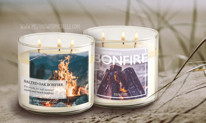
For those of you who don’t know me outside of the wax community, I am a full-time Graphic Designer. I get as excited as the rest of you when a new collection is testing and overnight shipping nolvadex am most likely even more critical than everyone else when it comes to the packaging. I think everyone is super judgmental when new candles are released because behind our Instagram pages we can’t smell them. The only thing we can do is judge their names and appearance.
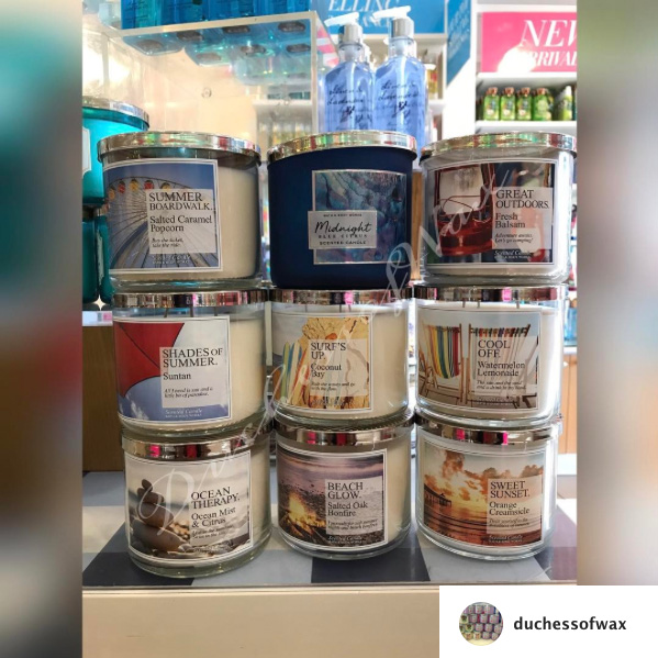
The 2017 Summer Stories candle collection popped up in test stores months ago but the candles are only appearing nationwide very recently. Like everyone else, I wasn’t the biggest fan of the “Times New Roman” labels but they didn’t repulse me by any means. While I’m extremely critical of design aspects, I also try to keep in mind that behind every label is careful art direction that we as consumers may not fully understand. However, with the information I am aware of regarding this collection, I decided to redesign the labels to show Bath & Body Works improvements that could’ve been made.
We can see that the original collection had a large graphic as the focal point that didn’t always directly correlate with the actual scent. On top of that is a random right-aligned opaque box containing the copy. The copy includes one name for the candle with incorrect punctuation, a secondary name for the candle, and a short storyline that offers no description of the fragrance. All left-aligned in a basic serif font.
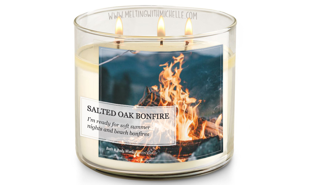
I decided the first step in my redesign would be to improve upon Bath & Body Works original design but keep some elements consistent. The main issue I noticed in the label was the two alignments competing with each other. Rather than keep left-aligned text within a right-aligned box, I moved the box entirely to the left and slightly adjusted the dimensions. To keep the “story” theme I continued to use a serif font but chose one with more curvatures. Finally, I eliminated one of the candle names because newspapers and magazines typically only have one.
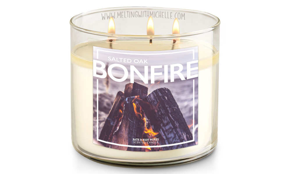
Next I wondered what I would’ve concepted if an art director gave me the constraints of a story theme for this candle collection. My mind immediately went to a magazine aesthetic rather than newspaper because the target audience is more likely to read that. Modern magazines typically have sans serif fonts with big bold typography which is what I tried to emulate. Here I’ve also eliminated any unnecessary copy to let the image tell the story itself. I would think the consumers would want to come up with their own story or memory when they smell the candle rather than read something forced on the packaging.
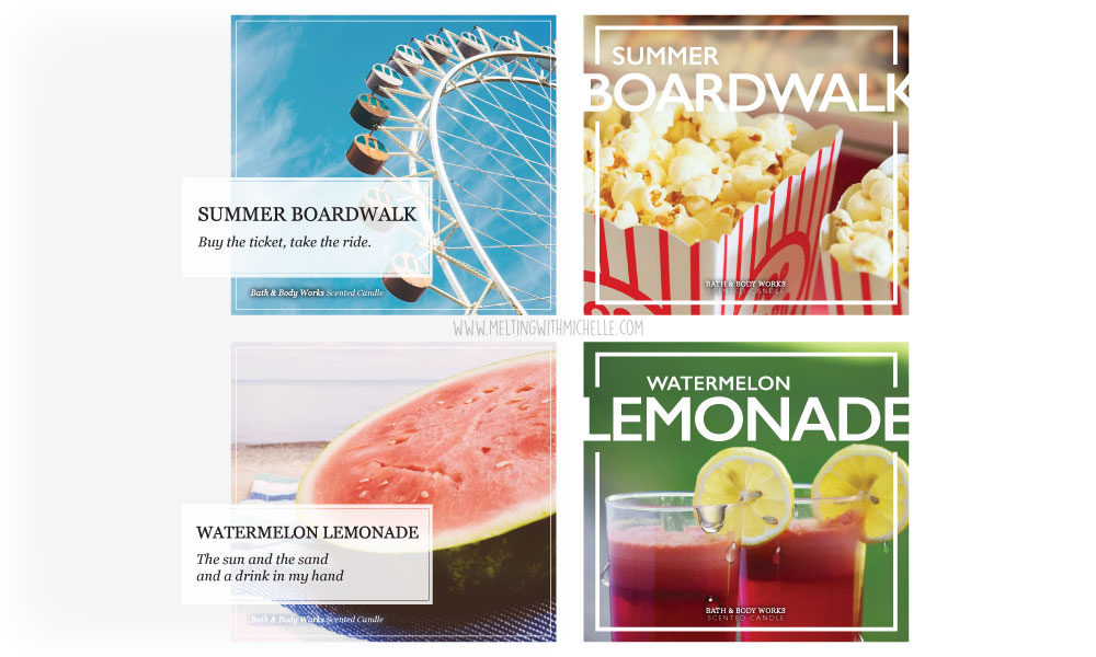
As you can see above, both of these designs can be easily adapted throughout the entire collection by a simple text update and switch of a picture. Maybe Bath & Body Works had a miscommunication regarding the art direction and had to quickly meet a deadline. Maybe it was truly poor direction or just a stressed designer. Whatever the reason, I’m willing to give the company the benefit of the doubt and hope they improve for Fall test candles. Also, if you’re looking for a new freelance designer Bath & Body Works, I’m most certainly interested in the job! 😉
What are your most and acquistare lo sconto priligy least favorite candle labels of all time? Share in the comments!

Leave a Comment